
This write up is intended to teach AP users the basics of excel. All of the instructions herein are based on microsoft excel 2003. The menus in later versions of excel are different, but the principles are the same so you may be able to figure out the basics based on this write up by going through the menus. The help feature in excel is very useful so I suggest using it if you get stuck.
Getting data from the AP
The first step to making a graph in excel is getting your data from the AP into excel. First open the AP manager and connect the AP to the computer. Once connected select advanced under the view tab in the AP manager. Now you should see your logs in the order they were collected. Right click the log you want to access and you should see an option to download the file. Save the file to any folder you want.
Opening your data in Excel
Excel may organize the data for you depending on the version you are using. However, because the file from the AP is a csv file instead of xls you may have to go through an additional process to get you data in order. Once excel is running go to the file menu and select open. Then select the datalog you want to work with. If it doesnt open automatically you will be prompted with a screen called the text import wizard. If this happens make sure you select Delimited under original data type, then click next. On the next screen you will be able to select your delimiters. You need to check the comma box. Once this is done click finished (not next) and your data will be organized by the PIDs that you logged.
The Basics of Excel
There are some simple terms that you should know when using excel. Your data is organized in vertical columns starting with column A. The numerical values are in horizontal rows that are numbered. Each box is referred to as a cell. You can click on the top of a column in the box that has a letter to highlight the entire column. You can also click on the top left corner in the empty box where the columns and rows meet to select your entire data set. This will be useful when organizing your data to make a chart or graph.
Organizing your data
To organize your data I suggest creating an additional sheet where you can copy the data you wish to graph. To do this right click the tab that should be labeled datalog x and select insert. A window will pop up from which you will select worksheet. Now you should have your original sheet and an additional sheet that is labeled sheet 1. You can rename this to keep organized by right clicking the sheet and selecting rename. You can also go back to the original sheet by left clicking on the tab.
Now that you have your second sheet you can select the data you want to graph. Remember more data isnt always better. You want your graph to be clear, so it is easy to interpret. You should select only the most important data, I recommend a 5-6 PIDs. To do this go to your original sheet, highlight the column, right click anywhere within the highlighting and select copy from the menu. I suggest starting with your RPM column since this will be your x-axis data. Once you have copied the data go to the second sheet you created and paste your RPM data in column A. This can be done by right clicking the first cell in the column and selecting paste. Repeat these steps with the additional data you want to include in your graph. Once all the important data is in the second sheet you should isolate the part of the log you want to graph. In other words you probably want to show a WOT run so you dont want the data that shows you cruising. The best way to isolate the data you want is to delete the unnecessary data. To do this select the data, right click and delete.
Graphing
Now that your data is organized you can make a graph. First off your x-axis is the horizontal axis and the y-axis is your vertical axis. Go to the sheet that you pasted your data in and highlight all the data including the titles (i.e. A/F ratio, fuel pressure.). Once your data is highlighted click on the icon in the top menu bar that looks like a small graph (you can also go to the insert menu and select chart). The chart wizard should open up and you can select the graph you want to use. I suggest the line graph. Now you will have to select a chart sub-type. The best one to use is in the top left corner. This will give you smooth lines, but you can use whatever you want. Once selected click next and the chart source data page will come up which shows a preview of your graph.
Dont worry if it looks horrible you can fix that later. You will see two tabs at the top of the page, one that says data range and one that says series. Click on the series tab, which will divide your data by the PIDs or variables you are graphing. A series is the data from only one of your columns. You shouldnt have to mess with the series unless you want to remove a variable from your chart. However, you do need to add your x-axis at this point, which we will make the RPM column. To do this put your curser in the category x-axis labels box and then highlight the rpm column in your data sheet. You should now see your rpms on the x-axis. Now click next to get to the chart options page. Here you can label your axes and add gridlines, but none of this is necessary if you are lazy. You should at least go to the legend tab and click top under the placement option. This will move your legend to the top of your graph, which will make the graph easier to read. Once you have gotten the graph the way you want it click next to get to the chart location screen. I like to make my graphs a separate sheet, by clicking the circle next to as new sheet and label the sheet to your liking. Click finish and you should see your graph.
Making your graph pretty
At this point your graph is probably difficult to read especially if you have graphed PIDs with low values like boost and a/f ratios along with PIDs with high values like fuel pressure. The easiest way to address this problem is to create a second y-axis. This can be done by right clicking the line that represents the data you want on the secondary y-axis. In the menu that pops up, select format data series. Now you should have a window with six tabs. Click the tab that says axis and then click secondary axis. On a side note, you will also notice a tab called patterns. You can change the color or weight of your lines using this tab. You should have a graph with two y-axes, which should be much easier to read. If you have another PID that would work better with the secondary axis you can repeat the procedure to add it to the secondary axis. However, you cannot make more than two y-axes in excel so dont waste your time trying. You should consider this when choosing the data you are going to graph.
If you are still not happy with the look of your graph you can right click anything and adjust colors, fonts and backgrounds. If select the entire graph by clicking on the border, you can then right click to access chart options or your source data, which will allow you to add gridlines or remove series that you decided that you didnt need. Make sure you are selecting the entire graph if you do not see these options in the right click menu. Once you get your graph the way you want it you can save the template and you will not have to do all of the formatting the next time you graph your log.
To make a template right click on the border of your chart and select chart type. Again, make sure you are selecting the entire graph if you do not see these options in the right click menu. In the chart type window select the custom type tab at the top. Now in the box that says (select from) you should check the circle next to (user-defined). Now click (add)and name your chart. The next time you make a graph select your template from the custom type tab and all of your formatting will load. Just make sure that you are graphing the same PID's in the same series order you did when you made the template and your graph will work perfectly. However, if you made a graph with two y-axes and you change the order of the PID's your axes may get messed up. You may want to create multiple templates if you are graphing different PID's.
Making your graph a jpeg, to post on the web.
Obviously you want to show off your new graph so you need to make it a jpeg. I use power point for this task, but I am sure there are other ways. To get your graph to power point select the entire graph, go to the edit menu at the top of the screen and copy the graph. Do not just paste the graph in power point, because the formatting will change. Instead go to the edit menu in power point and select paste special. In the window that pops up select (picture) enhanced metafile and select ok. Now you should see your graph. Right click the graph and select save as picture. In the window that pops up you need to change the file type to jpeg by using the pull down menu below your file name. Once you save you can upload your graph to any photo hosting website.
I hope this helps some of you out. Excel is actually very intuitive, so the best thing you can do is play around with it. Now lets see some datalogs.
Here are some of mine
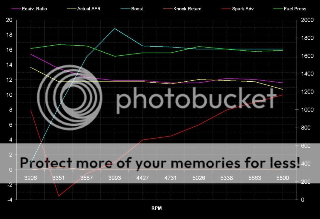
3rd gear notice fuel pressure is on the secondary y axis. Everything else is on the originial y-axis
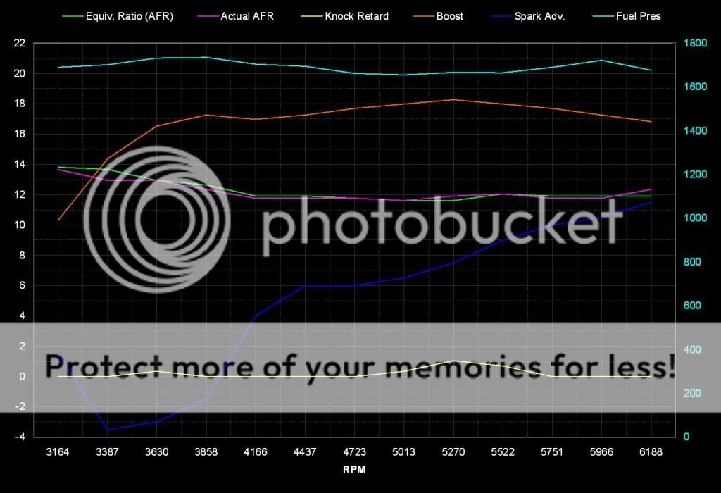
4th gear run
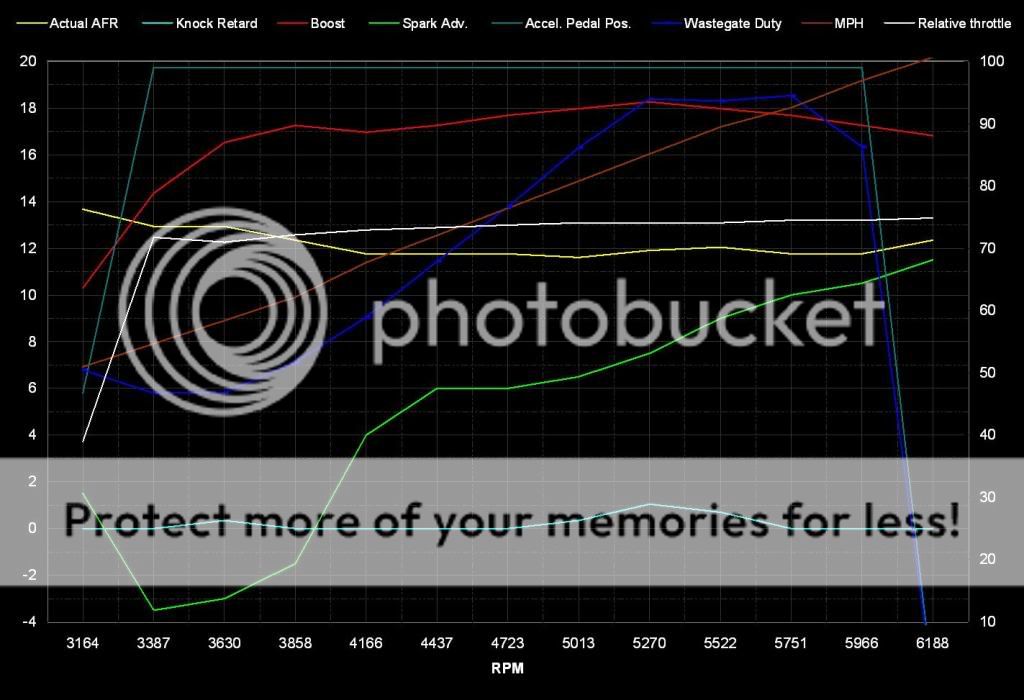
same 4th gear run but with different PID's. This graph is harder to read because I graphed 8 PID's which is too many in my opinion. You will also notice that the 4 PID's (mph, actual and relative pedal position and wastegate) that are on the right of the legend are on the secondary y-axis. The 4 PID's on the left are on the smaller y-axis.
Getting data from the AP
The first step to making a graph in excel is getting your data from the AP into excel. First open the AP manager and connect the AP to the computer. Once connected select advanced under the view tab in the AP manager. Now you should see your logs in the order they were collected. Right click the log you want to access and you should see an option to download the file. Save the file to any folder you want.
Opening your data in Excel
Excel may organize the data for you depending on the version you are using. However, because the file from the AP is a csv file instead of xls you may have to go through an additional process to get you data in order. Once excel is running go to the file menu and select open. Then select the datalog you want to work with. If it doesnt open automatically you will be prompted with a screen called the text import wizard. If this happens make sure you select Delimited under original data type, then click next. On the next screen you will be able to select your delimiters. You need to check the comma box. Once this is done click finished (not next) and your data will be organized by the PIDs that you logged.
The Basics of Excel
There are some simple terms that you should know when using excel. Your data is organized in vertical columns starting with column A. The numerical values are in horizontal rows that are numbered. Each box is referred to as a cell. You can click on the top of a column in the box that has a letter to highlight the entire column. You can also click on the top left corner in the empty box where the columns and rows meet to select your entire data set. This will be useful when organizing your data to make a chart or graph.
Organizing your data
To organize your data I suggest creating an additional sheet where you can copy the data you wish to graph. To do this right click the tab that should be labeled datalog x and select insert. A window will pop up from which you will select worksheet. Now you should have your original sheet and an additional sheet that is labeled sheet 1. You can rename this to keep organized by right clicking the sheet and selecting rename. You can also go back to the original sheet by left clicking on the tab.
Now that you have your second sheet you can select the data you want to graph. Remember more data isnt always better. You want your graph to be clear, so it is easy to interpret. You should select only the most important data, I recommend a 5-6 PIDs. To do this go to your original sheet, highlight the column, right click anywhere within the highlighting and select copy from the menu. I suggest starting with your RPM column since this will be your x-axis data. Once you have copied the data go to the second sheet you created and paste your RPM data in column A. This can be done by right clicking the first cell in the column and selecting paste. Repeat these steps with the additional data you want to include in your graph. Once all the important data is in the second sheet you should isolate the part of the log you want to graph. In other words you probably want to show a WOT run so you dont want the data that shows you cruising. The best way to isolate the data you want is to delete the unnecessary data. To do this select the data, right click and delete.
Graphing
Now that your data is organized you can make a graph. First off your x-axis is the horizontal axis and the y-axis is your vertical axis. Go to the sheet that you pasted your data in and highlight all the data including the titles (i.e. A/F ratio, fuel pressure.). Once your data is highlighted click on the icon in the top menu bar that looks like a small graph (you can also go to the insert menu and select chart). The chart wizard should open up and you can select the graph you want to use. I suggest the line graph. Now you will have to select a chart sub-type. The best one to use is in the top left corner. This will give you smooth lines, but you can use whatever you want. Once selected click next and the chart source data page will come up which shows a preview of your graph.
Dont worry if it looks horrible you can fix that later. You will see two tabs at the top of the page, one that says data range and one that says series. Click on the series tab, which will divide your data by the PIDs or variables you are graphing. A series is the data from only one of your columns. You shouldnt have to mess with the series unless you want to remove a variable from your chart. However, you do need to add your x-axis at this point, which we will make the RPM column. To do this put your curser in the category x-axis labels box and then highlight the rpm column in your data sheet. You should now see your rpms on the x-axis. Now click next to get to the chart options page. Here you can label your axes and add gridlines, but none of this is necessary if you are lazy. You should at least go to the legend tab and click top under the placement option. This will move your legend to the top of your graph, which will make the graph easier to read. Once you have gotten the graph the way you want it click next to get to the chart location screen. I like to make my graphs a separate sheet, by clicking the circle next to as new sheet and label the sheet to your liking. Click finish and you should see your graph.
Making your graph pretty
At this point your graph is probably difficult to read especially if you have graphed PIDs with low values like boost and a/f ratios along with PIDs with high values like fuel pressure. The easiest way to address this problem is to create a second y-axis. This can be done by right clicking the line that represents the data you want on the secondary y-axis. In the menu that pops up, select format data series. Now you should have a window with six tabs. Click the tab that says axis and then click secondary axis. On a side note, you will also notice a tab called patterns. You can change the color or weight of your lines using this tab. You should have a graph with two y-axes, which should be much easier to read. If you have another PID that would work better with the secondary axis you can repeat the procedure to add it to the secondary axis. However, you cannot make more than two y-axes in excel so dont waste your time trying. You should consider this when choosing the data you are going to graph.
If you are still not happy with the look of your graph you can right click anything and adjust colors, fonts and backgrounds. If select the entire graph by clicking on the border, you can then right click to access chart options or your source data, which will allow you to add gridlines or remove series that you decided that you didnt need. Make sure you are selecting the entire graph if you do not see these options in the right click menu. Once you get your graph the way you want it you can save the template and you will not have to do all of the formatting the next time you graph your log.
To make a template right click on the border of your chart and select chart type. Again, make sure you are selecting the entire graph if you do not see these options in the right click menu. In the chart type window select the custom type tab at the top. Now in the box that says (select from) you should check the circle next to (user-defined). Now click (add)and name your chart. The next time you make a graph select your template from the custom type tab and all of your formatting will load. Just make sure that you are graphing the same PID's in the same series order you did when you made the template and your graph will work perfectly. However, if you made a graph with two y-axes and you change the order of the PID's your axes may get messed up. You may want to create multiple templates if you are graphing different PID's.
Making your graph a jpeg, to post on the web.
Obviously you want to show off your new graph so you need to make it a jpeg. I use power point for this task, but I am sure there are other ways. To get your graph to power point select the entire graph, go to the edit menu at the top of the screen and copy the graph. Do not just paste the graph in power point, because the formatting will change. Instead go to the edit menu in power point and select paste special. In the window that pops up select (picture) enhanced metafile and select ok. Now you should see your graph. Right click the graph and select save as picture. In the window that pops up you need to change the file type to jpeg by using the pull down menu below your file name. Once you save you can upload your graph to any photo hosting website.
I hope this helps some of you out. Excel is actually very intuitive, so the best thing you can do is play around with it. Now lets see some datalogs.
Here are some of mine
3rd gear notice fuel pressure is on the secondary y axis. Everything else is on the originial y-axis
4th gear run
same 4th gear run but with different PID's. This graph is harder to read because I graphed 8 PID's which is too many in my opinion. You will also notice that the 4 PID's (mph, actual and relative pedal position and wastegate) that are on the right of the legend are on the secondary y-axis. The 4 PID's on the left are on the smaller y-axis.
