
You are using an out of date browser. It may not display this or other websites correctly.
You should upgrade or use an alternative browser.
You should upgrade or use an alternative browser.
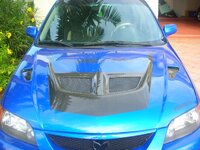
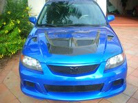
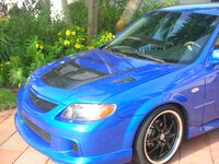
custom hood
- Thread starter levison
- Start date
- :
- 2002 BJFW, 2007 BK3P, 1979 SA22C, 2005 BK3P
levison said:the only C- is your protege ES
thats a pretty low stab to take at someone for offering an opinion.
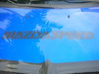
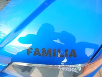
that said, i like the hood all with the exception of the familia portion on the front. i think the mazdaspeed cut away phrase looks great.
- :
- 2000 DX
<TABLE id=HB_Mail_Container height="100%" cellSpacing=0 cellPadding=0 width="100%" border=0 UNSELECTABLE="on"><TBODY><TR height="100%" UNSELECTABLE="on" width="100%"><TD id=HB_Focus_Element vAlign=top width="100%" background="" height=250 UNSELECTABLE="off">I agree with Ken. I think the blue and CF look great together. I think the Mazdaspeed looks real good on the hood. You did a job well done. I would of done without the Familia though. As long as you like the hood, thats all that should matter.</TD></TR><TR UNSELECTABLE="on" hb_tag="1"><TD style="FONT-SIZE: 1pt" height=1 UNSELECTABLE="on">
</TD></TR></TBODY></TABLE>
</TD></TR></TBODY></TABLE>
Captain KRM P5 said:thats a pretty low stab to take at someone for offering an opinion.
that said, i like the hood all with the exception of the familia portion on the front. i think the mazdaspeed cut away phrase looks great.
kudakev615
Member
- :
- pro5
yeah, the hood looks good minus the lettering. i think it would 10xs better if the rest of the car was aggressive enough to back up the hood
kudakev615
Member
- :
- pro5
I SEE IT NOW!!avarela86 said:But it reminds me of the transformers LOGO.
I like the color contrast but the design is a little iffy.
But you're a douche...DECEPTICONS TRANSFORM!!
levison said:i was hit by a log on I 95 and had the option to paint the hood. to avoid the scratches i painted it how it looks. and am very happy how it came out. asking for opionions is for msp only. stock proteges dont count.
But you're a douche...DECEPTICONS TRANSFORM!!
Similar threads

- Replies
- 0
- Views
- 1K
- Replies
- 17
- Views
- 6K